🔙 Back
🚚 Hiboo
The all-in-one tool for equipment data, operation and maitenance.
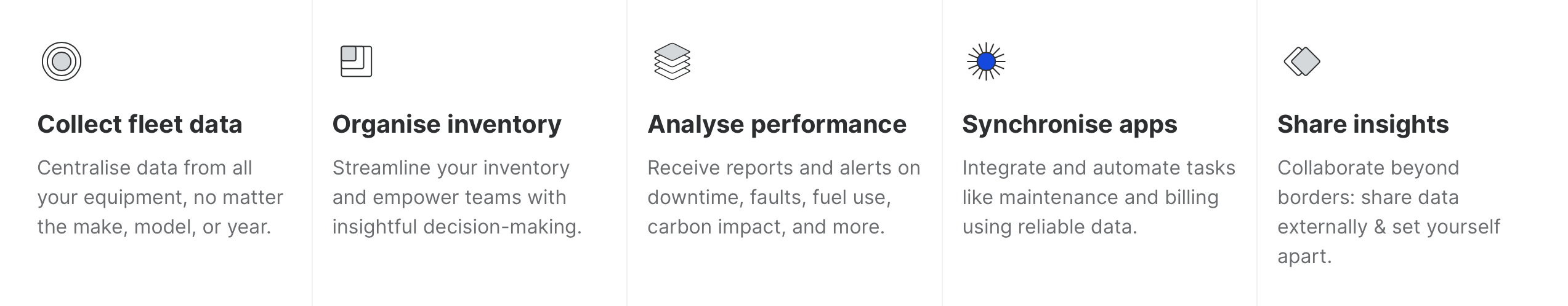
Hiboo is a software that collects data from all your heavy equipment and utility vehicles in one place — enhancing your productivity and energy efficiency seamlessly.
Who are they ? What are they doing ?
Equipment management, elevated!
The ambition is to support decision makers involved in the management of fleets of equipment, operating at different organisational levels, in the construction sector: Materials Directors, Workshop Managers, Site Managers, Rental Agency Directors, Salespeople…
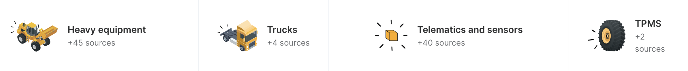
Hiboo wants to become the all-in-one solution for different roles to access decision support elements for their connected equipment fleets: construction machinery, heavy goods vehicles, light vehicles, utilities...
My assignment
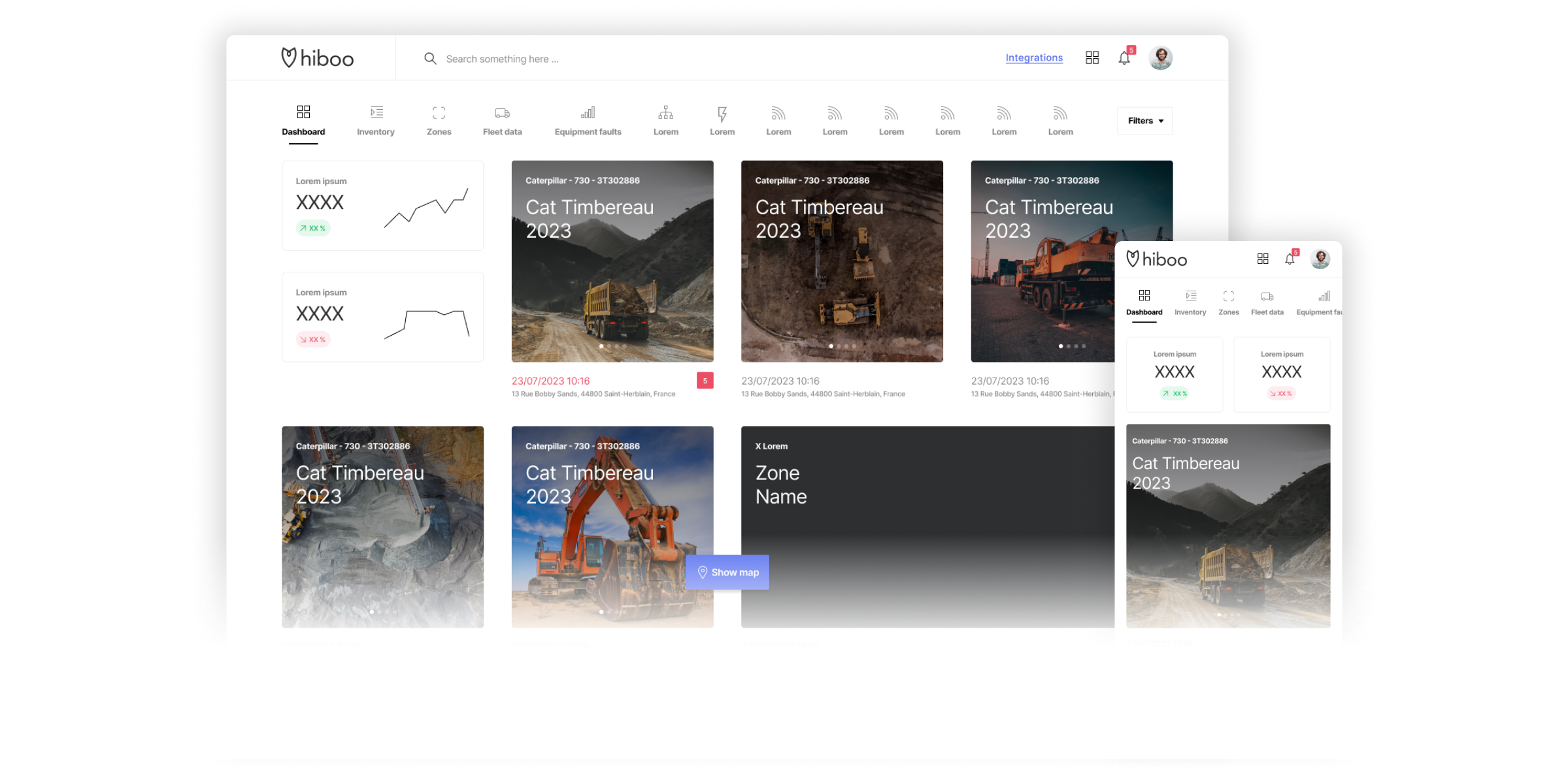
Hiboo’s current home page is a map screen and is part of the product's heritage. Our users think the map is the app’s home page.
Featuring this map as a landing page has become inconsistent with our analytical positioning.
Users are increasingly requesting easy-to-digest information. They are too busy to search for crucial information in the application.
The number of reports has increased and could continue to do so, creating a cognitive load for users.
How ?
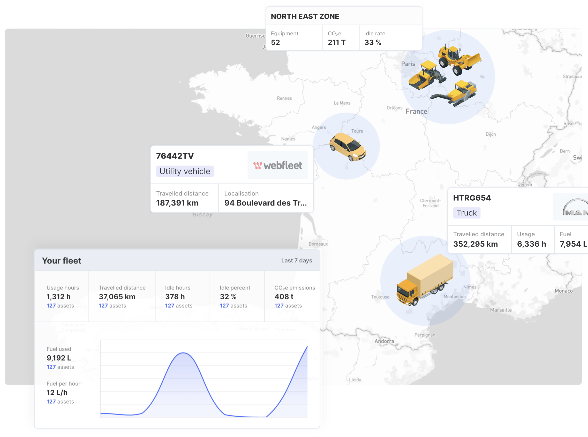
By giving quick and easy access to the map. Access should remain a visually dominant element so as not to frustrate current users too much.
By making this page more functional and visually attractive. 2 keywords: "Overview" and "Data-friendly".
As a data analysis tool, it is necessary to give users a dashboard view that allows them to quickly understand and prioritise relevant information.
By suggesting a modular dashboard that allows for easy addition of report features. Offering dashboard customisation to only highlight important data at this navigation level.